Case Study · Nonprofit
Website Design · Website Development · Content Strategy
Harvesting for Seed
An interactive archive for a closing nonprofit, designed to preserve a decade of agricultural justice work and serve as a living resource for the landworkers and collectives who carry it forward.
Movement Ground Farm was a nonprofit dedicated to agricultural justice and the movement of land back into the hands of landworkers and collectives. After a decade of work, they needed a website that could preserve and share that history before the organization closed.
They came to me with a vision for an interactive timeline. What they actually needed was bigger than that: a site that could function as a narrative, an archive, and a living resource for the landworkers and collectives who would carry the work forward.
Why this project mattered
Movement Ground Farm's decade of work belonged to the people it served — landworkers, organizers, and collectives who rarely see their histories preserved with care. The organization was closing, and the website would be the primary place this history lived. That raised the stakes of every decision: what to include, how to make it searchable, and how to honor the weight of the material without making it feel like a museum. I needed to serve the people whose stories were on the page as much as the people who would come looking for them.
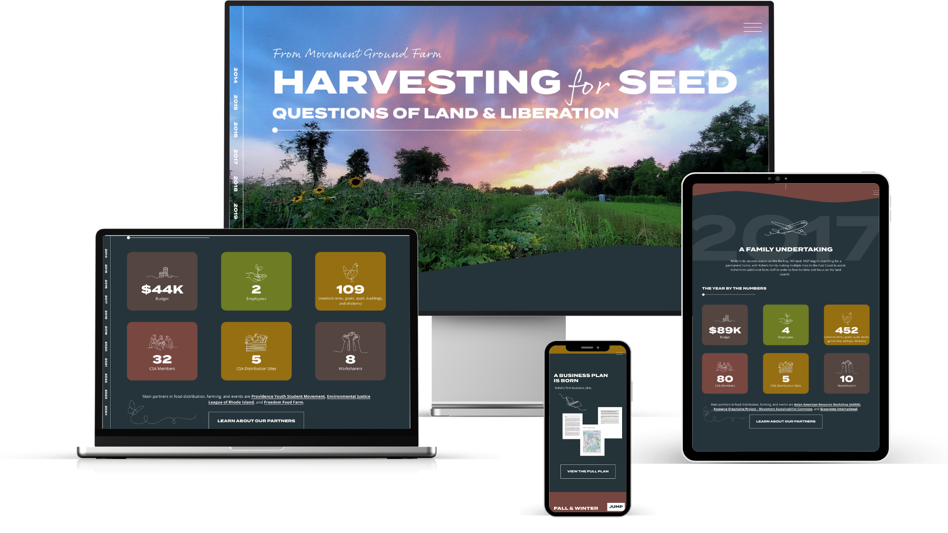
Fig. 1 — The homepage timeline was organized into ten years of material by season. Animated counters, handwritten callouts, and selected line art throughout the site.
My Role
I led website design and full development on this project, with content strategy done in collaboration with an independent consultant. The consultant conducted interviews and wrote the long-form copy over the course of several months; I then helped organize it and turn it into a structured, navigable experience.
Discovery & Strategy
The client arrived with a decade's worth of material — interviews, reflections, statistics, quotes, photos, and videos gathered across ten years of work. My first job was to figure out how to make it digestible for their audience.
Through discovery, I uncovered that a simple timeline wouldn't be enough. The site needed to do three things at once: tell the story of the organization, serve as a searchable archive, and function as a genuine resource — not a superficial highlight reel, but a repository of real stories and knowledge that other landworkers could learn from.
That reframing led to two structural decisions that shaped the rest of the project. First, I proposed organizing the ten years into seasons rather than a flat chronological list, with a color palette drawn from each season — a way to give the archive natural rhythm and make a decade of material less overwhelming. Each year would be based on a template, both to help cue the user with a predictable pattern and to reduce development time. Second, I recommended a templated, slide-out entry structure for each of the 100+ moments on the timeline.
Fig. 2 — A strategic custom template (left) guiding content placement was the first step in the process. This wireframe became the foundation for an initial full-color mockup (right).
Design & Development
The homepage is an interactive timeline that unfolds year by year. Each year sits inside a templated structure — a consistent visual container that holds summaries, quotes, charts, photos, and videos in a predictable rhythm. The repetition is doing real work: the more consistent the frame, the more the unique content inside each year can stand on its own.
The brand direction grew out of the site itself. The client had a logo and a rough sense of what they wanted, but no defined system. I selected the typography, the color palette, and the full illustrative language. Every visual choice was made in service of the content — illustrations were chosen story by story rather than pulled from generic farming themes, so an entry about land tenure looked different from an entry about a community harvest.
Highlights
Slide-out story panels were a critical piece of the experience — a way to let readers go deep into an individual moment without leaving the timeline. This was one of the most important UX decisions in the project, because it integrated the archive within the exploratory timeline.
The archive was also accessible on a stand-alone page with a custom filter so a landworker looking for a specific type of story — a fundraiser, an interview, a policy moment — could find it without scrolling through a decade.
Subtle scroll and hover animations make the timeline feel alive without distracting from the material. Things move when you interact with them; otherwise they stay out of the way.
Line art, carefully selected to match the subject of each section, gives the site warmth and a human hand without crowding the content.
Animated counters in each year surface key milestones as quick snapshots and as context for everything else in that section.
Handwritten-font callouts throughout the timeline suggest a narrator's voice — a second layer of commentary separate from the documented events.
A custom loading screen frames the site as a digital exhibit. It's a short moment designed to set a deliberate, intentional tone — signaling that the reader is entering an experience.
Fig. 5 — Handwritten-font callouts throughout the timeline suggest a narrator's voice and teach users how to explore the timeline at the same time.
Fig. 3 — A mockup shows a templated year container holding summaries, quotes, media, and milestones in a consistent structure organized by season. Animated counters and line art reflecting the purpose of each moment are instrumental to the experience.
Fig. 4 — Custom slide-out story panels were a critical part of the design, letting readers go deep into an individual moment without leaving the timeline.
Developing the Archive
The homepage timeline tells the story of Movement Ground Farm's decade in narrative order — a reader-led experience meant to be traveled through from beginning to end. But a true archive also had to support the opposite: a reader arriving with a specific question, looking for a specific kind of story.
The archive page solves for that. It holds all 100+ events in a single filterable grid, independent of the timeline. A landworker researching how other collectives structured their leases can filter by topic and jump straight to those entries. A researcher looking for events from a particular season can narrow to that. A casual visitor can keyword-search across the full decade. The archive page is what turns the site from a tribute into a resource.
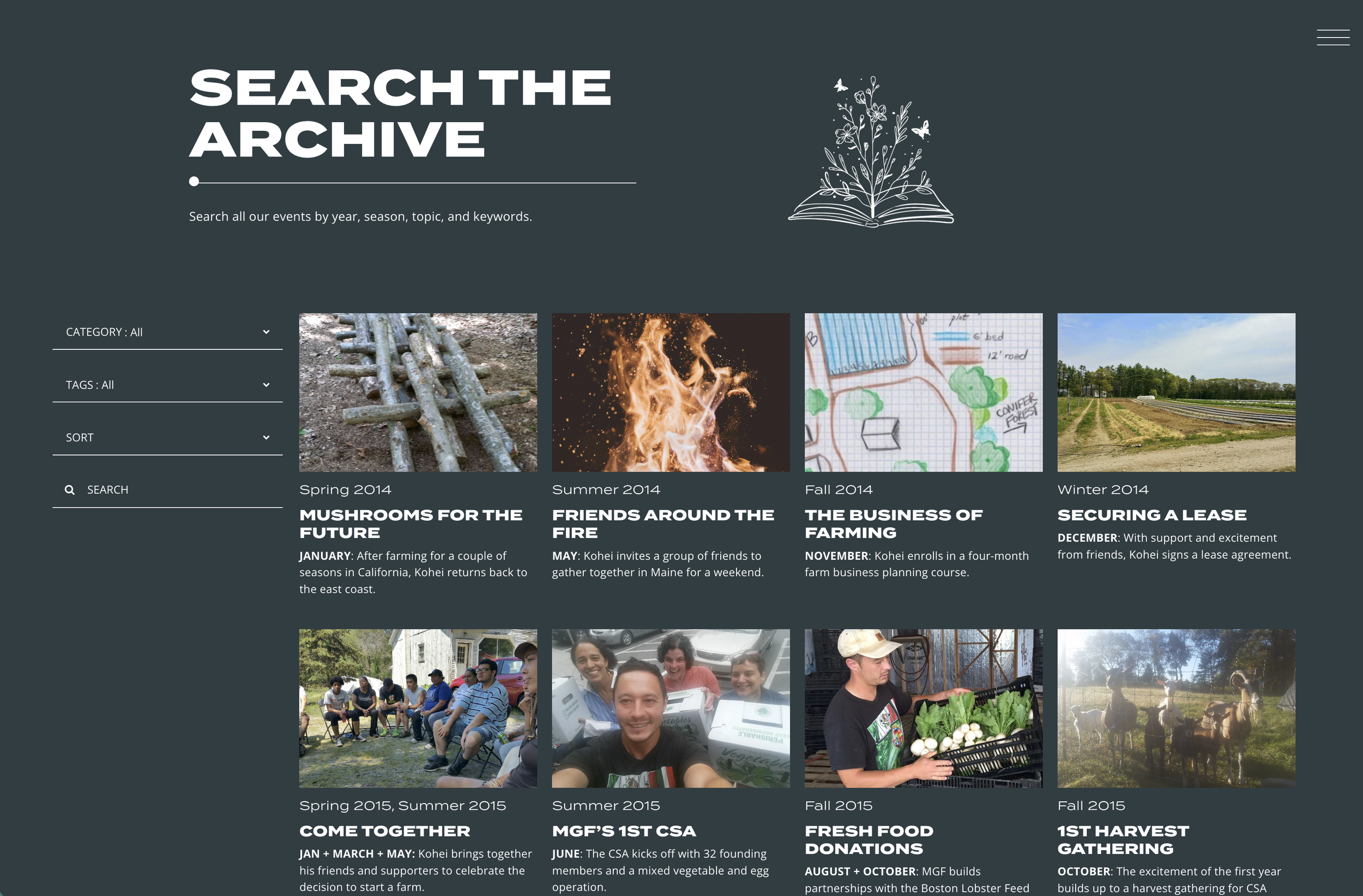
Fig. 6 — The Search the Archive page holds all 100+ events in a filterable, searchable grid. Category, tags, and keyword search let visitors cut across a decade of material by question rather than chronology.
Beyond the Timeline
The timeline and the archive handle the chronological and searchable dimensions of the farm's history, but a decade of work didn't live only in events. It lived in relationships — with partner organizations, with CSA distribution sites, with the collectives and youth groups who worked the land. These relationships needed their own space on the site, and they needed a treatment that felt as considered as the timeline.
To hold this dimension of the work, I designed a dedicated Partnerships page anchored by two visualizations. A donut chart maps every organization that hosted a CSA drop-off site, with a hover interaction surfacing the number of years each partner served. Below it, a custom grid called Our Connected Work visualizes the organizations that hosted or collaborated on events at the farm — the size and prominence of each block scales to how active that partner was, and every block links out to their own site. A standard list would have conveyed the same information, but it wouldn't have conveyed the shape of the network. The custom layout carries that visual weight in a way text alone couldn't.
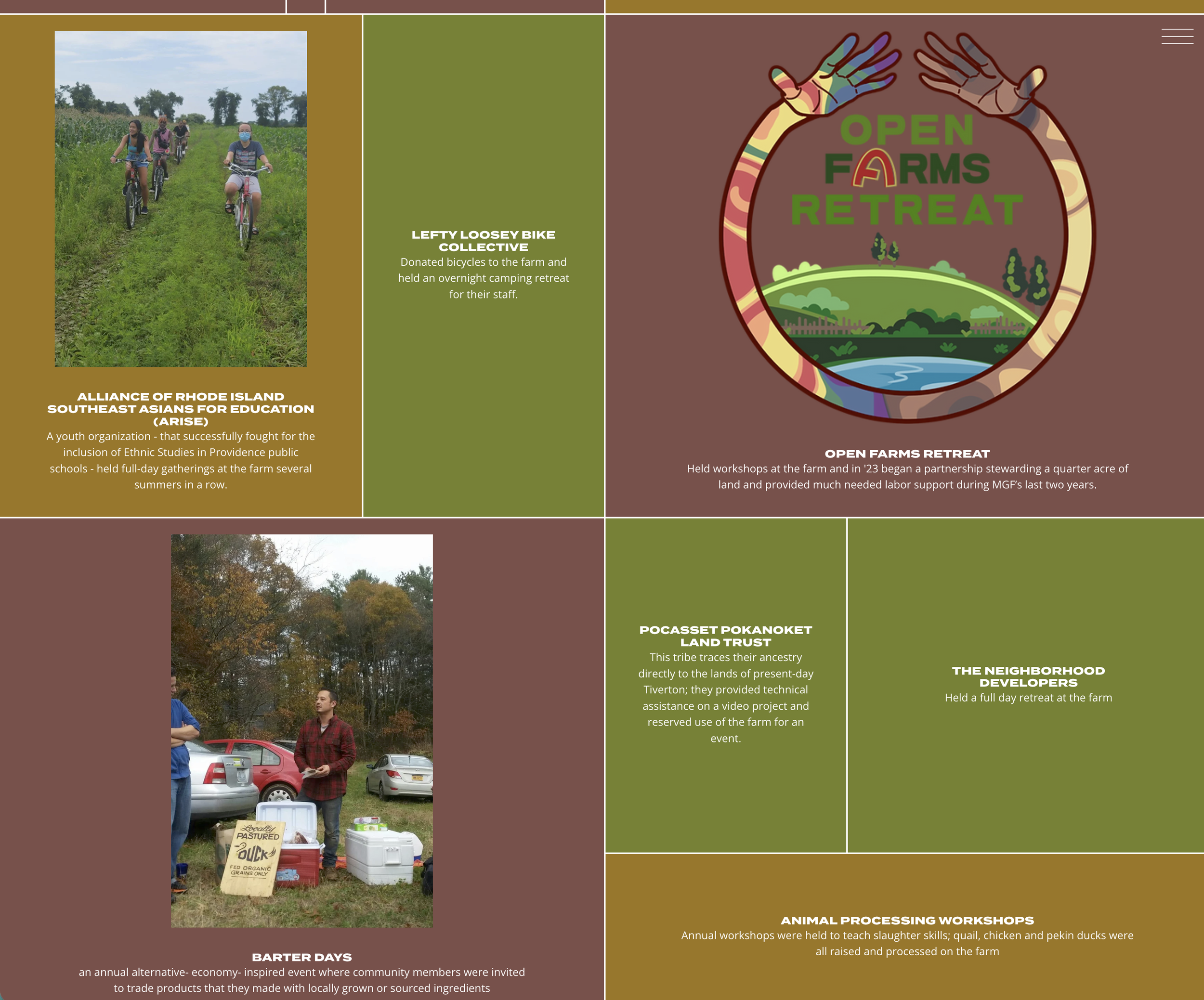
Fig. 7 — Our Connected Work, a custom grid where more prominent blocks correspond to partners who collaborated most often with the farm. Each block links out to the partner organization's site.
Outcome
The site launched on time — before the organization closed — and exceeded the original success metrics by a wide margin. The goal was 1,000 views and 40 shares across three channels. In the first three months, it received 3,124 views and 2,800 unique visitors, with traffic arriving through direct links, referrals, social, and search. Visitors spent an average of 3 minutes and 11 seconds on the homepage and nearly as long on other pages — indicating real engagement, not bouncing. Several hundred people explored the full site in depth.
More than the numbers, the project did what the organization hoped it would: it preserved a decade of work as something real and findable, after the organization itself was no longer there to tell the story.
In Their Words
"In terms of the website as a project and a product, I think this part was a huge success. I have received heartfelt responses — folks who felt like this was a true gift that has never been done before in this way. I am so happy that MGF has this monument, legacy, and documentation."
— Founder, Movement Ground Farm