Case Study · Healthcare
UI/UX Strategy · Website Design · Branding · Graphic Design
Bili Blanket Baby
A redesign for a same-day phototherapy rental company serving new parents, medical providers, and distribution partners.
The Challenge
Bili Blanket Baby rents phototherapy blankets for newborns with jaundice, often providing them within four hours of order placement. The work is time-sensitive, medical, and personal — the founder started the company after all four of her own children experienced newborn jaundice.
The old site was functional, but didn’t showcase the level of care and detail that is fundamental to the business. The homepage, for example, led with a hero gallery and menu items lacking organization, making it hard for users with very different needs to find what they needed quickly.
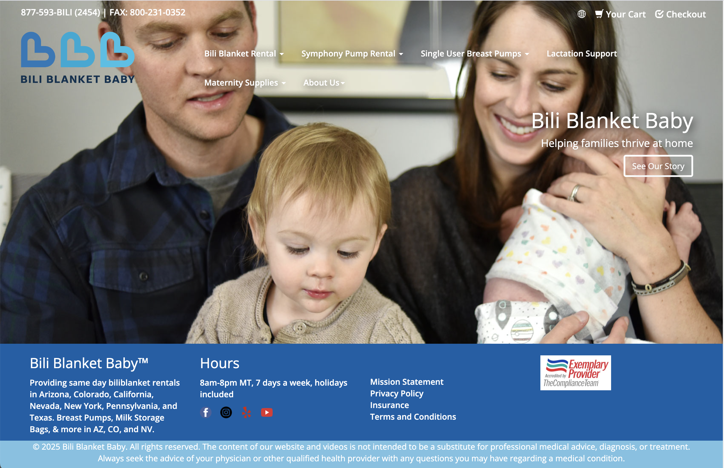
Fig. 1 — The previous homepage layout.
Why this project mattered
The families who come to Bili are often meeting the site at one of the hardest moments in their lives— their days-old child has just been diagnosed with jaundice. A parent, probably sleep-deprived and scared, is trying to understand what a phototherapy blanket is and whether their insurance will cover it. Bili's team leads with genuine care for those families, and I wanted the site to mirror that. This project tested what empathy-driven design actually means: every design decision here needed to be filtered through the question of whether it would make a parent's day easier or harder.
My Role
I led website strategy, UX/UI, brand refresh, and responsive design for this project. I also worked in close collaboration with the client’s developer throughout the build, providing suggestions and giving feedback during testing. After launch, I continued with Bili as a graphic design partner, producing a brand book, sales deck, flyers, postcards, and social templates from the same visual system.
Discovery & Strategy
Before designing anything, I ran a discovery process and delivered a website strategy document that became the anchor for every decision that followed. It mapped three distinct user personas: a new parent, a medical provider, and a manufacturer sales manager, with separate acquisition, conversion, and retention needs for each.
Bili focuses on patient support just as much as new orders, so alongside the personas, I built two customer journey flowcharts that mapped to each experience. I worked closely with Bili’s team to confirm what critical decisions different users needed to make when they were on the site. Were they looking for a phototherapy blanket? That’s a sales journey. Did they need help using it? That’s a support journey. Together, we put ourselves in our three primary users’ shoes to create these flows. These maps allowed for deeper conversations about the user experience and ultimately became the foundation for the rest of the site architecture.
Fig. 2 — The customer journey map focusing on order experience. A second map, not pictured, was created for the patient support journey.
Design & Build
The redesigned site is organized around Bili’s primary products: phototherapy blankets, maternity supplies, and lactation support.
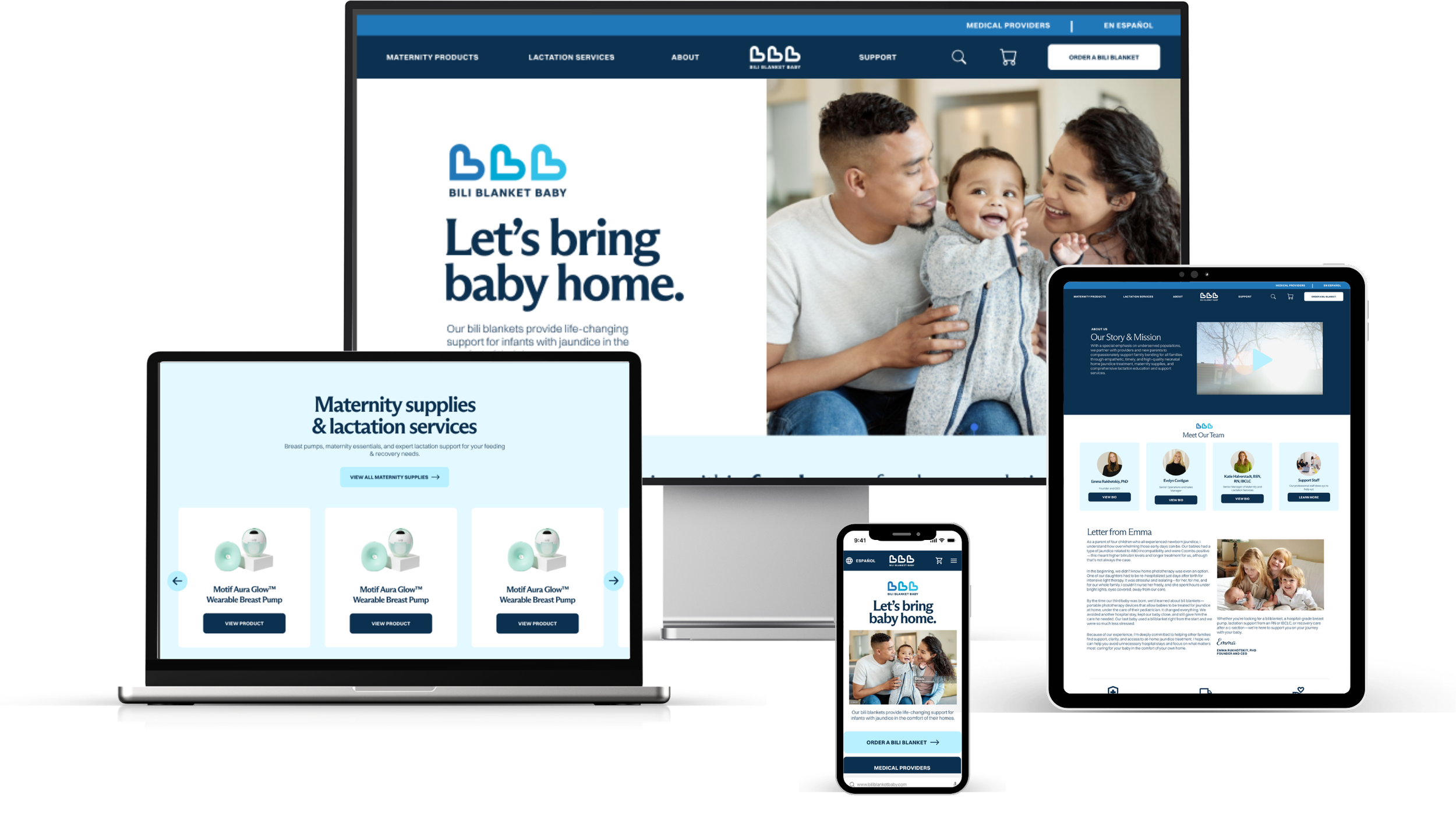
Fig. 3 — Part of the new website’s homepage on desktop.
Highlights
Straightforward navigation and calls-to-action on the home page directing users to the next step.
A calmer, more credible visual identity. A refined color palette, custom fonts from Berlin-based studio Dinamo to cleanly pair with their existing sans-serif, and warm photography are major updates. The goal was an interface that reads as trustworthy to a hospital and approachable to an anxious parent at the same time.
Mobile-first design for the parent flow, since new parents typically arrive on a phone from a provider referral and need to order without friction. The old site loaded on mobile but didn't prioritize that experience.
A desktop-optimized path for medical providers with limited time, who are usually ordering from a clinic workstation and expect a form-heavy, document-driven experience.
Expanded Spanish-language support. The prior site had limited translation; the redesign made en español a prominent toggle on every page.
Fig. 4 — Part of the new website’s homepage on mobile.
The Product Page
The product page was one of the most important pieces of UX work in the redesign. Because Bili's catalog is insurance-gated — which items a customer sees depends on what plan covers them — the page had to teach users that selecting insurance is a prerequisite step, not an optional filter. Alongside this, we consolidated the catalog into filterable category pages. On the old site, products like breast pump parts lived across multiple separate pages with no way to filter; in the redesign, they all live under Maternity Supplies.
The old page presented insurance selection as a flat row of logo cards. It was functional as a filter, but it didn't signal that the choice was actually changing what the user could see.
The redesign turned the page into a guided flow. An opening hero frames the category with a warm photograph and a short, human description. A single clear directive — "First, select your insurance" — replaces the logo grid with a dropdown that makes the sequence explicit while retaining the logo images within the drop-down for quick visual recognition.
A filter was added as a key new feature, letting parents narrow results within a single page rather than navigating between multiple product pages. Products appear on a high-contrast background with visible descriptions so parents can quickly understand what each item is without having to click through.
The result is a page that does what the old version couldn't: it guides a stressed or unfamiliar user through a non-obvious ordering logic without making them feel like they're navigating bureaucracy.
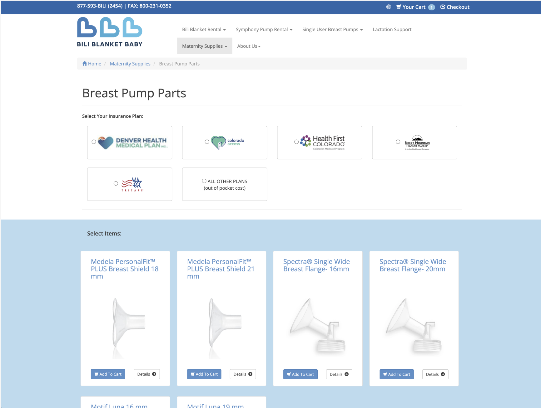
Fig. 5 — The old product page lacked an introduction and had an insurance selector that was easy to dismiss.
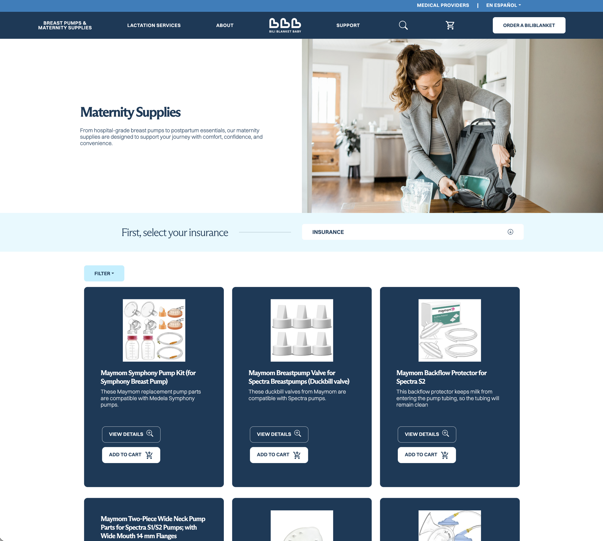
Fig. 6 — The new page prompts the user to select their insurance first in order for the page to show covered products. Maternity products are now on one product category page that can be easily filtered.
Design System & Developer Collaboration
I built a component library and type system in Figma with reusable components for buttons, navigation, dropdowns, filters, product cards, cart structures, icons, and a typography scale. Pages were designed at both desktop and mobile breakpoints.
Throughout the process, I worked closely with the developer to make sure each design was buildable, checking in on feasibility as we went rather than designing in a vacuum. I used prototypes to demonstrate interactivity and help the Bili team see the site before build-out. Some ambitious ideas didn't make the cut due to scope, but most of what I designed made it into the live site. Ongoing collaboration like this — where the designer is a real partner to the build, not just a deliverable-thrower — is how I prefer to work.
Outcome
The site launched and is live at www.biliblanketbaby.com. It now scales to support Bili's growth through a templated, category-based architecture, and the design system carried directly into the ongoing brand collateral I produced post-launch.
In Their Words
"Working with Avni and Funda was one of the best decisions we made for our business. Before the redesign, our website didn't reflect the depth, credibility, or empathy of what we actually offer. We operate in a medical, time-sensitive space where trust and clarity matter, and the site felt flat and didn't guide people effectively. Avni completely transformed that.
She has an exceptional ability to take in a huge amount of information, even in an industry that was entirely new to her, and distill it down to what actually matters.
The end result is a website that finally matches who we are. It feels dynamic, engaging, and dimensional, and it clearly communicates both the clinical credibility and the human side of our work. Avni brings a rare combination of strategic clarity, operational discipline, and strong design instinct. I would recommend her without hesitation to any founder who wants a process that is as solid as the outcome."
— Founder, Bili Blanket Baby